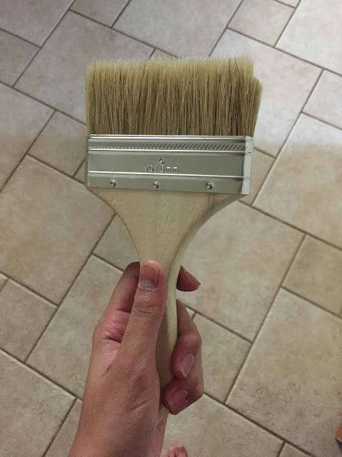
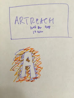
The process behind one poster. As the Public Relations officer for Lynbrook's ArtReach club, I have to make a lot of posters, flyers, and other ads to promote our club. I recently spent about two days working on one specific poster that I'm really proud of. It started off with as a simple idea, and grew into an amazing project. Here is the very first preliminary sketch of what I wanted it to look like: It would say ArtReach in really big letters, but instead of having the letters painted, everything else would be painted and the letters would be left white, taking advantage of negative space. In order to do this, I would need to use painter's tape to cover up the letters. Then came the fun part...painting! But I didn't want it to look like regular brush strokes. I really wanted this poster to pop, so instead of painting normally, I used paintbrushes and sponges to throw the paint onto the poster, creating a splatter effect....


